> ## Documentation Index
> Fetch the complete documentation index at: https://docs.wavebybemobi.com/llms.txt
> Use this file to discover all available pages before exploring further.
# Iframe
> How to use the web components through iframes
This guide explains how to integrate our web components using iframes. These components are designed to be easily embedded into any web application while maintaining consistent styling and behavior.
## Offers Grid Component
The Offers Grid component displays a collection of offer cards with various layout options and filtering capabilities.
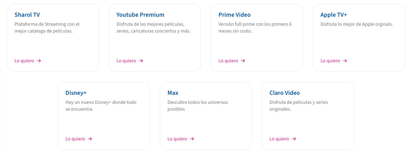 ### Integration
```html theme={null}
```
### Query Parameters
| Parameter | Description | Example |
| -------------- | ------------------------------------------------------------ | --------------------- |
| cardType | Visual style of cards (text, hero, squared, features, topup) | `cardType=features` |
| page | Page number for pagination | `page=1` |
| pageSize | Number of items per page | `pageSize=12` |
| productId | Filter offers by product ID | `productId=123` |
| salesChannelId | Filter by sales channel | `salesChannelId=456` |
| billingType | Filter by billing type (PREPAID/POSTPAID) | `billingType=PREPAID` |
| name | Filter by offer name | `name=Premium` |
| metadata | Filter by metadata fields | `metadata.key=value` |
| orderBy | Field to sort by (createdAt/name) | `orderBy=createdAt` |
| order | Sort direction (ASC/DESC) | `order=desc` |
### Card Types
The component supports different card layouts through the `cardType` parameter:
1. **default**: Standard detailed card with hero, title, description, price, and features
### Integration
```html theme={null}
```
### Query Parameters
| Parameter | Description | Example |
| -------------- | ------------------------------------------------------------ | --------------------- |
| cardType | Visual style of cards (text, hero, squared, features, topup) | `cardType=features` |
| page | Page number for pagination | `page=1` |
| pageSize | Number of items per page | `pageSize=12` |
| productId | Filter offers by product ID | `productId=123` |
| salesChannelId | Filter by sales channel | `salesChannelId=456` |
| billingType | Filter by billing type (PREPAID/POSTPAID) | `billingType=PREPAID` |
| name | Filter by offer name | `name=Premium` |
| metadata | Filter by metadata fields | `metadata.key=value` |
| orderBy | Field to sort by (createdAt/name) | `orderBy=createdAt` |
| order | Sort direction (ASC/DESC) | `order=desc` |
### Card Types
The component supports different card layouts through the `cardType` parameter:
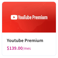
1. **default**: Standard detailed card with hero, title, description, price, and features
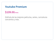
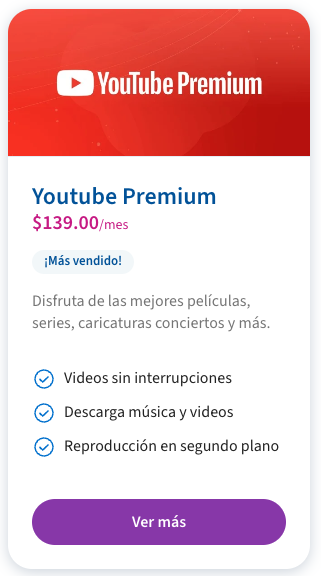 2. **text**: Simple text-based card with title and description
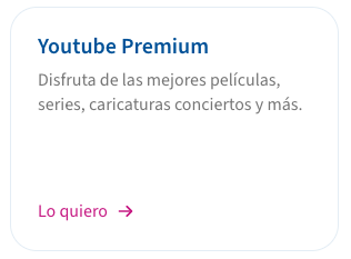 3. **hero**: Large card with prominent image
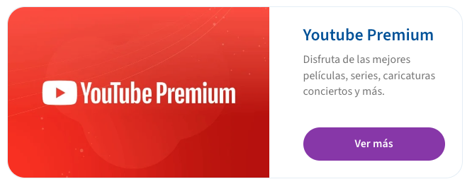 4. **squared**: Compact square card with image
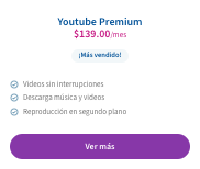
 5. **features**: Detailed card with feature list
 6. **topup**: Special card for top-up offers
 ## Single Offer Card Component
Displays a single offer card using base64 encoded offer data.
### Integration
```html theme={null}
```
### Offer Object Structure
The offer object should follow this structure before base64 encoding:
```typescript theme={null}
interface Offer {
id: string;
name: string;
description: string;
billingType: "PREPAID" | "POSTPAID";
pricing: {
model: "STANDARD";
properties: {
price: string;
currency: string;
recurrence: "SPOT" | "DAILY" | "MONTHLY" | "WEEKLY" | "YEARLY";
payInAdvance: boolean;
};
};
product: {
id: string;
name: string;
description: string;
metadata: Record;
};
features: string[];
metadata: Record;
ctaLink?: string;
bannerUrl?: string;
}
```
Example usage:
```javascript theme={null}
const offerData = {
id: "123",
name: "Premium Package",
// ... other fields
};
const base64Data = btoa(JSON.stringify(offerData));
const iframeSrc = `https://wave-domain.com/offers?data=${base64Data}&cardType=features`;
```
## Product Page Component
Displays a complete product page with details and associated offers.
### Integration
```html theme={null}
```
The product page consists of three main sections:
1. Product Hero - Displays main product information
2. Product Features - Lists product features
3. Product Offers - Shows associated offers
## Single Offer Card Component
Displays a single offer card using base64 encoded offer data.
### Integration
```html theme={null}
```
### Offer Object Structure
The offer object should follow this structure before base64 encoding:
```typescript theme={null}
interface Offer {
id: string;
name: string;
description: string;
billingType: "PREPAID" | "POSTPAID";
pricing: {
model: "STANDARD";
properties: {
price: string;
currency: string;
recurrence: "SPOT" | "DAILY" | "MONTHLY" | "WEEKLY" | "YEARLY";
payInAdvance: boolean;
};
};
product: {
id: string;
name: string;
description: string;
metadata: Record;
};
features: string[];
metadata: Record;
ctaLink?: string;
bannerUrl?: string;
}
```
Example usage:
```javascript theme={null}
const offerData = {
id: "123",
name: "Premium Package",
// ... other fields
};
const base64Data = btoa(JSON.stringify(offerData));
const iframeSrc = `https://wave-domain.com/offers?data=${base64Data}&cardType=features`;
```
## Product Page Component
Displays a complete product page with details and associated offers.
### Integration
```html theme={null}
```
The product page consists of three main sections:
1. Product Hero - Displays main product information
2. Product Features - Lists product features
3. Product Offers - Shows associated offers
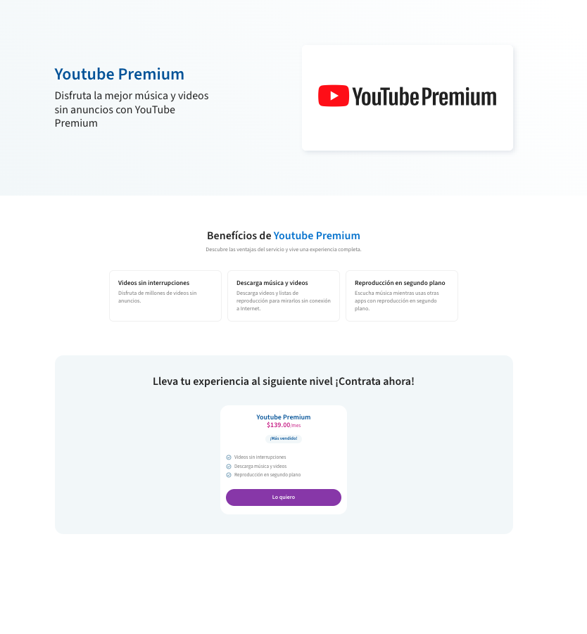 This component automatically fetches and displays all product information and related offers based on the provided product ID in the URL.
## Checkout Component
The Checkout component provides a complete purchase flow for offers. It can be integrated into any web application and maintains communication with the parent window for dynamic height adjustment.
### Integration
```html theme={null}
```
### Component Flow
The checkout process consists of three main states:
1. Initial verification (required only when user is not logged in)
2. Order confirmation
3. Success message
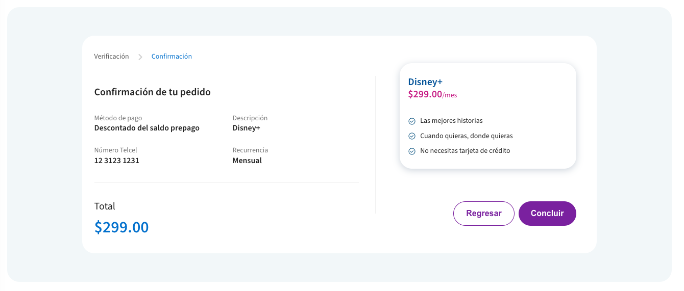
#### Summary View
The summary view displays the offer details and purchase confirmation:
This component automatically fetches and displays all product information and related offers based on the provided product ID in the URL.
## Checkout Component
The Checkout component provides a complete purchase flow for offers. It can be integrated into any web application and maintains communication with the parent window for dynamic height adjustment.
### Integration
```html theme={null}
```
### Component Flow
The checkout process consists of three main states:
1. Initial verification (required only when user is not logged in)
2. Order confirmation
3. Success message
#### Summary View
The summary view displays the offer details and purchase confirmation:
 #### Success View
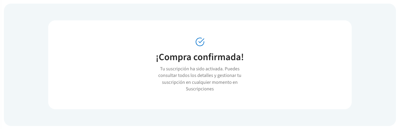
After successful purchase, the component displays a confirmation message:
#### Success View
After successful purchase, the component displays a confirmation message:
 ### Offer Display in Checkout
The checkout component uses two specialized card types for displaying offer details:
* [Default Card](/offers_sdk/iframe#default-card)
* [Topup Card](/offers_sdk/iframe#topup-card)
### Integration with Offers
The checkout component can be accessed in several ways:
1. **From Offer Cards**: When users click the CTA button on any offer card, they are directed to the checkout flow for that specific offer.
2. **Direct URL**: Using the offer ID in the URL: `/offers/checkout/{offerId}`
3. **From Product Pages**: When browsing product offers, the CTA buttons link to the checkout component.
## Dynamic Height Adjustment
All components emit a `postMessage` event containing the scroll height. This allows for dynamic iframe height adjustment to prevent unwanted scrollbars.
```javascript theme={null}
window.addEventListener('message', function(e) {
if (e.data && e.data.scrollHeight) {
const iframe = document.querySelector('#myIframe');
iframe.style.height = `${e.data.scrollHeight}px`;
}
});
```
The component sends height updates on:
* Initial load
* State changes
* Content updates
* Error messages display
Remember to implement the height adjustment listener for all iframe integrations to ensure proper display without scrollbars.
### Offer Display in Checkout
The checkout component uses two specialized card types for displaying offer details:
* [Default Card](/offers_sdk/iframe#default-card)
* [Topup Card](/offers_sdk/iframe#topup-card)
### Integration with Offers
The checkout component can be accessed in several ways:
1. **From Offer Cards**: When users click the CTA button on any offer card, they are directed to the checkout flow for that specific offer.
2. **Direct URL**: Using the offer ID in the URL: `/offers/checkout/{offerId}`
3. **From Product Pages**: When browsing product offers, the CTA buttons link to the checkout component.
## Dynamic Height Adjustment
All components emit a `postMessage` event containing the scroll height. This allows for dynamic iframe height adjustment to prevent unwanted scrollbars.
```javascript theme={null}
window.addEventListener('message', function(e) {
if (e.data && e.data.scrollHeight) {
const iframe = document.querySelector('#myIframe');
iframe.style.height = `${e.data.scrollHeight}px`;
}
});
```
The component sends height updates on:
* Initial load
* State changes
* Content updates
* Error messages display
Remember to implement the height adjustment listener for all iframe integrations to ensure proper display without scrollbars.